Introduction
If you’ve compared a globe and a paper map, you’ve probably noticed that despite displaying the same information, the two have slight differences. For example, on most paper maps Greenland appears rather large, even though this is not the case on an actual globe. Such distortions are unavoidable when trying to make a spherical surface flat. Imagine trying to cut open an inflatable beach ball in such a way that it forms a perfect square or rectangle- it’s impossible! Therefore, in order to transform a globe into a map, we use a function called a stereographic projection. This post will explore how this is done and the distortions that result from it.

Stereographic Projections
The function to perform a stereographic projection is fairly simple. First, imagine we position our globe above the map we want to make. For any point \( a \) on our map, its resulting location on the globe, \( f(a) \), is found by drawing a line from \( a \) to the topmost point of the globe. The location where this line intersects the surface of the globe is \( f(a) \).

Let’s look at an example to get an idea of how this works. Imagine it is the year 2200 and you are one of many humans living in Martian settlements. One day, you are out driving on the planet’s surface when disaster strikes- you crash your space car in a crater. You have a limited amount of oxygen and need to get to the closest Martian settlement to avoid dying. Fortunately, you salvage a Martian map from the wreckage:

Since you really don’t want to run out of oxygen and die, you want to head toward the closest settlement. However, you are worried about map distortions and want to get an idea of what the actual Martian globe looks like. You happen to know (you are very smart) that this map was made from a stereographic projection in which the map was placed 50 units beneath the globe’s center. Consequently, you determine the stereographic projection looked as follows:

Great, you now have an idea of what the actual planet looks like. Your next step is to compare your map to the original globe to get an idea of what distortions have occurred.
Distortions
Your first priority is to find the closest settlement to walk to. Notice that on the original map the red path appears shorter, since the crater you’d have to walk around is smaller. However, on the original globe, the blue path actually appears to be slightly shorter!

Notice the same thing happens with the squares- the settlement at the end of the blue path appears to be larger in the paper map; however, on the globe we can see that it’s actually about the same size as the one at the end of the red path. This is because these shapes were stretched during the projection and appear bigger on the map than they actually are. This effect is much more pronounced at the edge of the map than in the middle. For example, consider these identical circles at the center of the map, which still appear identical when projected onto the globe:
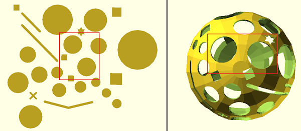
Conversely, consider the three apparently identical circles at the edge of the map. Notice that on the globe their actual sizes are drastically different:

Let’s look at another example of distortion. Imagine you followed the blue path shown previously and arrived safely at the settlement. Looking again at the map, it seems you could travel in a straight line to arrive at the settlement in the lower right corner of the map. However, when you look at the actual globe, you realize the path isn’t straight at all!

In fact, if you tried to go in a straight line, you’d either miss the settlement or fall into a crater! This is another result of the stretching that happens during our projection. For example, look at the parallel lines (representing trenches) on the paper map that are much less parallel on the actual globe:

This same issue occurs if we are trying to get from the previous settlement to the home base. The trenches below seem to form a distinct angle on the paper map. However, on the globe, the ends of these lines get pulled downward, making the landmark seem much less angular:

Again, notice that all of these distortions are found at the edges of our projection- the center of our map is much more faithful to the original globe and, thus, much more trustworthy.
Why this example?
I chose this example primarily because I find maps to be the most interesting application of stereographic projections. It also gives us a meaningful way to discuss the resulting distortions, since it allowed me to discuss the way in which the projection could be misleading. I also thought the example of Mars would be interesting and engaging. Initially, I had intended the map to only consist of “craters”; however, I discovered that (other than comparing size differences) circles don’t stretch as notably as squares or lines. Thus, I added “trenches” and “settlements” in order to add more interesting features to my model.
Author: Sarah B
Comments
Post a Comment